
Bandwell Lifestyle Health
- Four Cabais
- Apr 8
- 1 min read

Updated: Apr 9
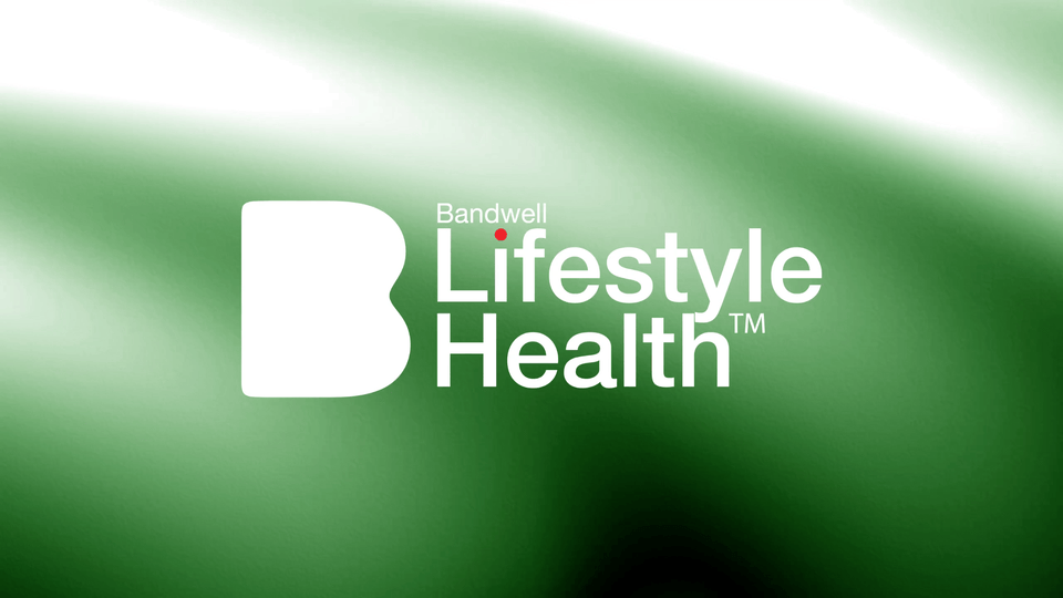
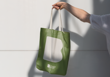
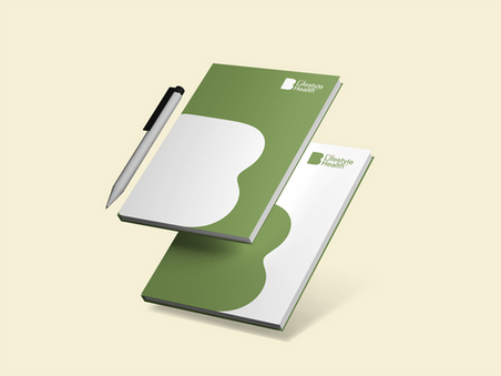
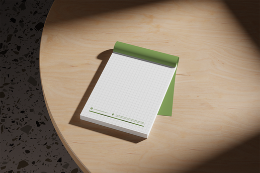
Branding for a Manila based consumer wellness company.

Our goal was to design an identity that supports better days, better life. From the moment people wake up to the evening they rest. The smooth B shaped icon represents this essential life cycle. The red dot completes the story, symbolizing an imperfection that lingers and disrupts an otherwise better day. BLH was built for that red flag. We’re proud to have designed this identity.


Comments